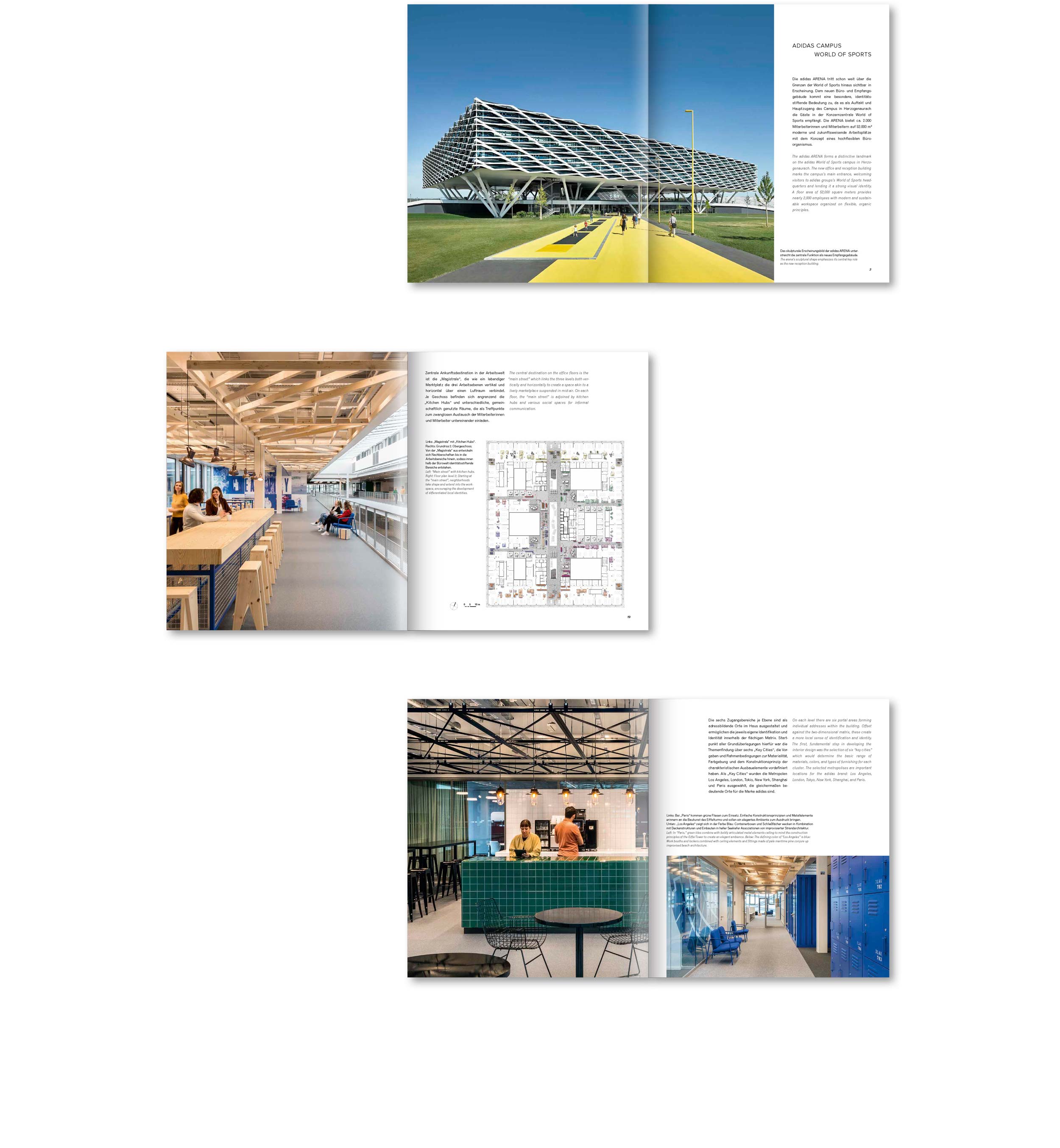
Project adidas ARENA
Location Herzogenaurach, Germany
Client Behnisch Architekten
Completion 2019
ORIENTATION
A known problem with new buildings is that they are often very new. It is not one of the greatest skills of largely industrially manufactured components to illustrate the handwriting of a master builder. They better want to shine in the greatest possible perfection and precision. Brand new flawless surfaces also tend to show neither texture nor quirks - if we exclude concrete from the list.
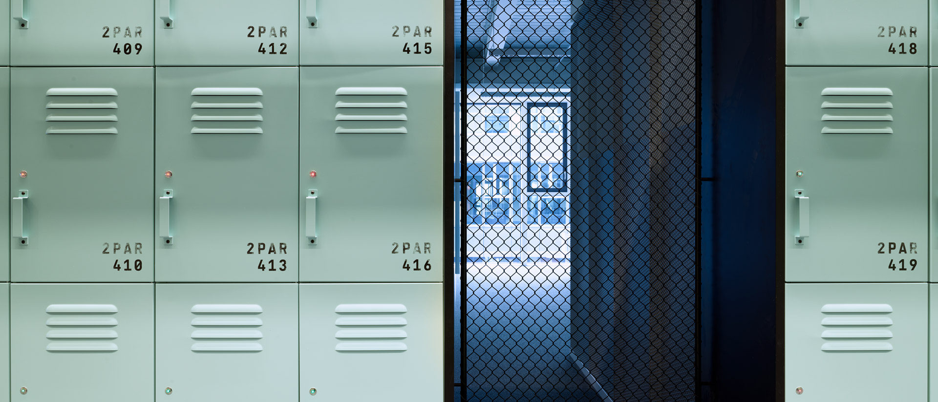
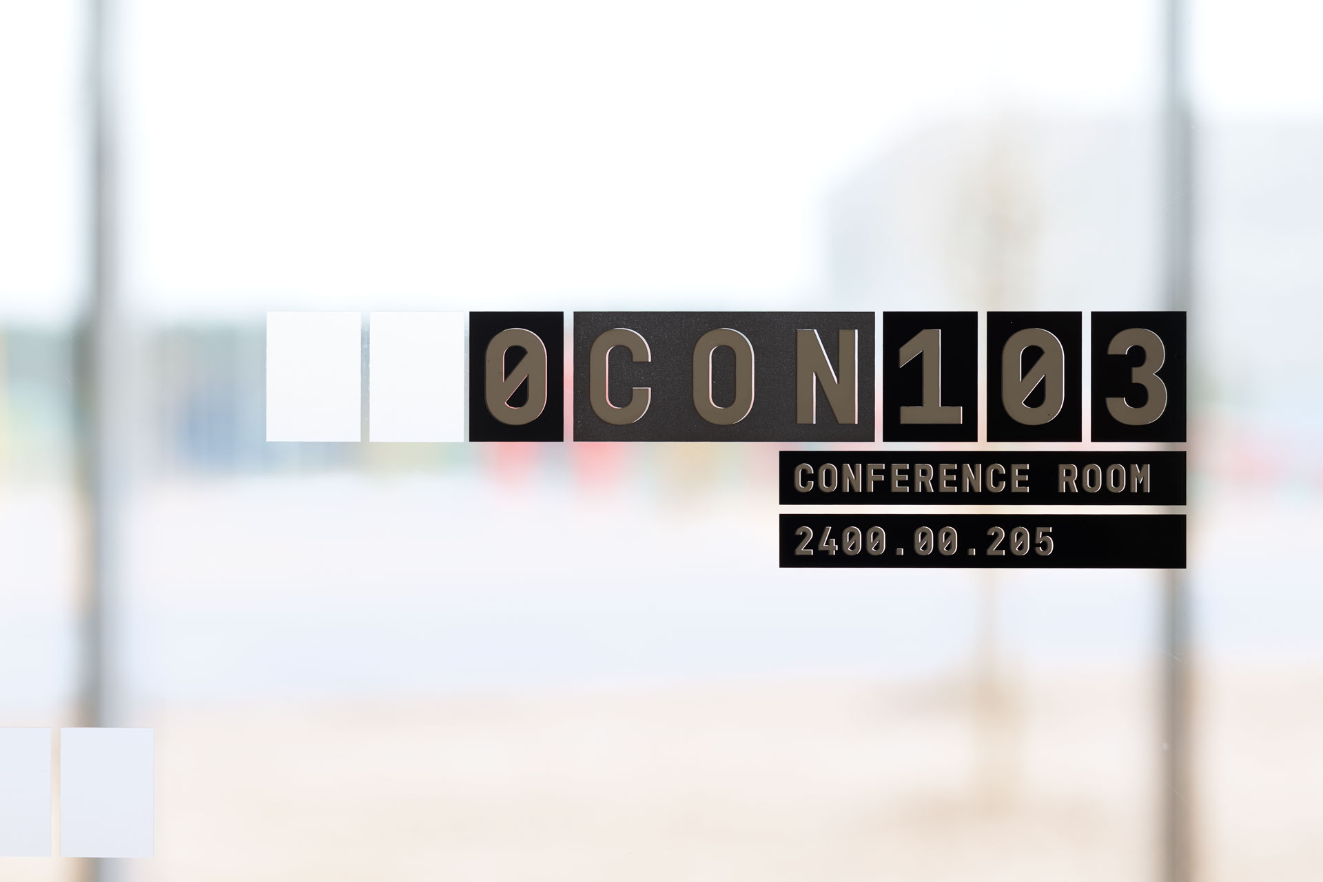
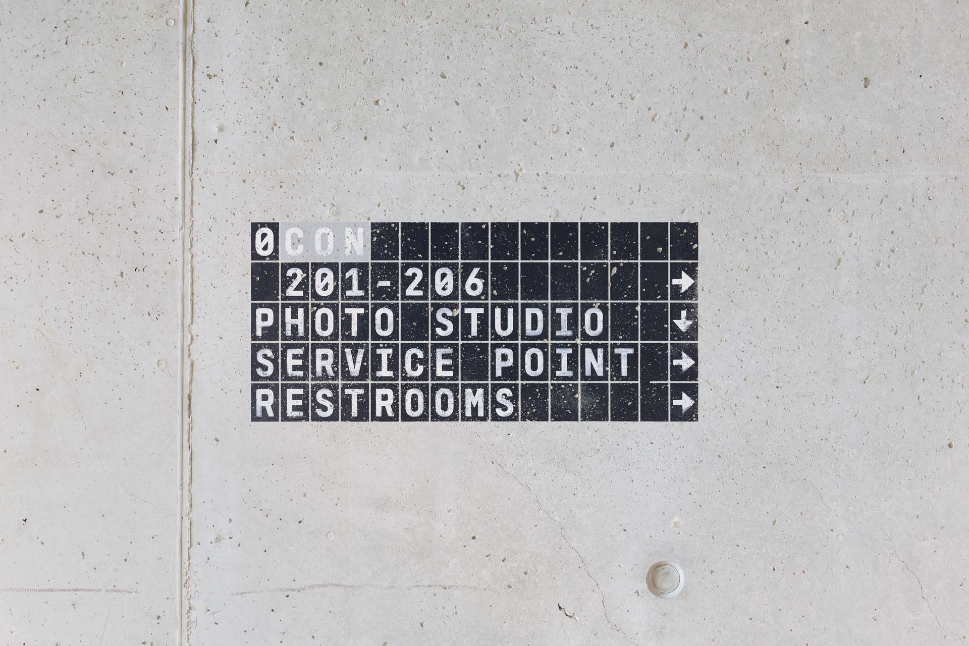
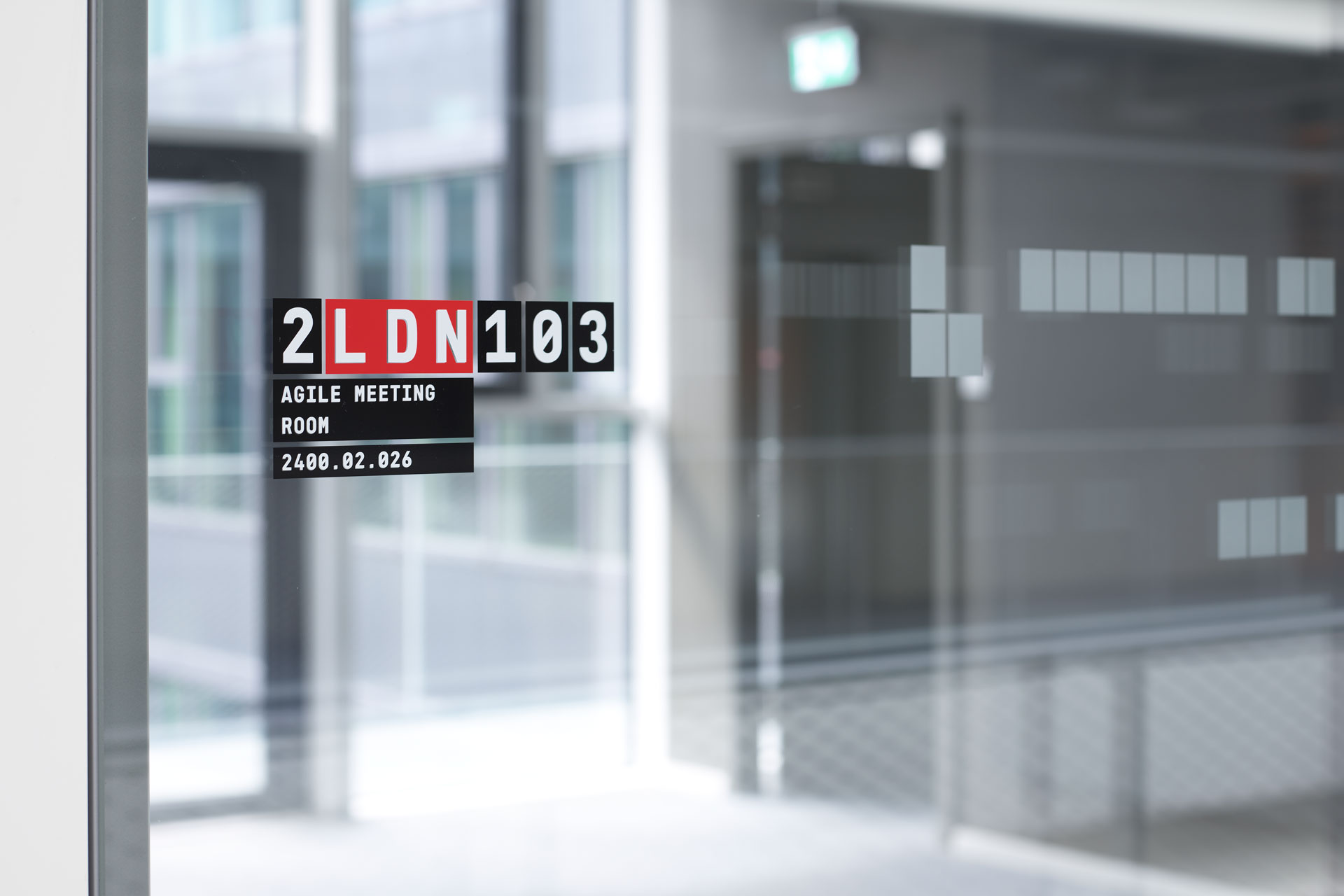
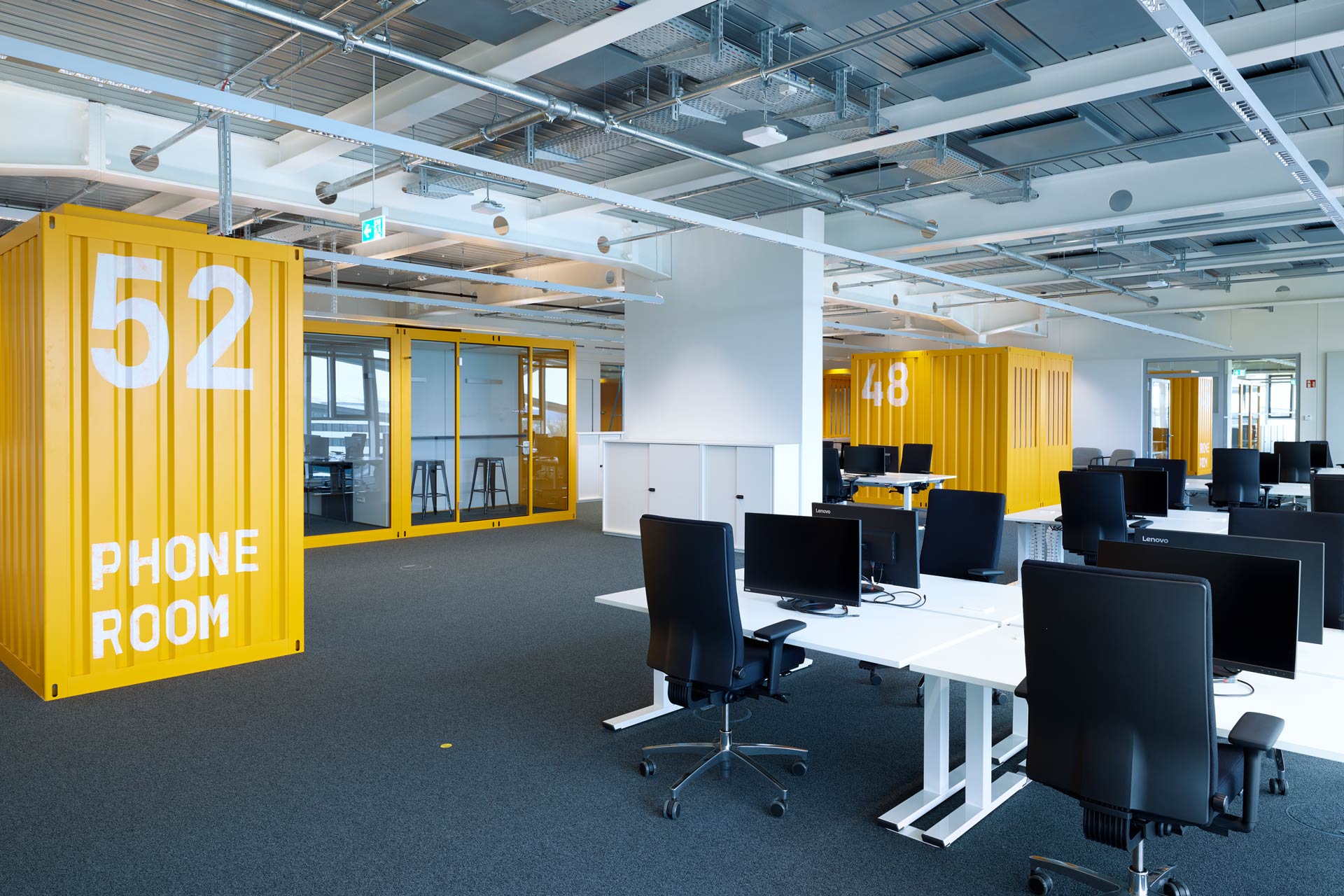
Here, the majority of the orientation-related graphics are directly stenciled on the walls or screen printed on glass. All made by hand. All looking different. All intentionally perfectly imperfect.


COLORS
Repetitive floor plans work unintentionally but nevertheless successfully against the idea of intuitive orientation. Adding color might help, at least the not colorblind.
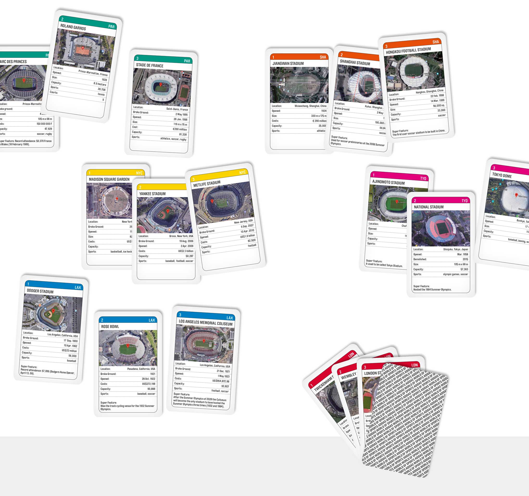
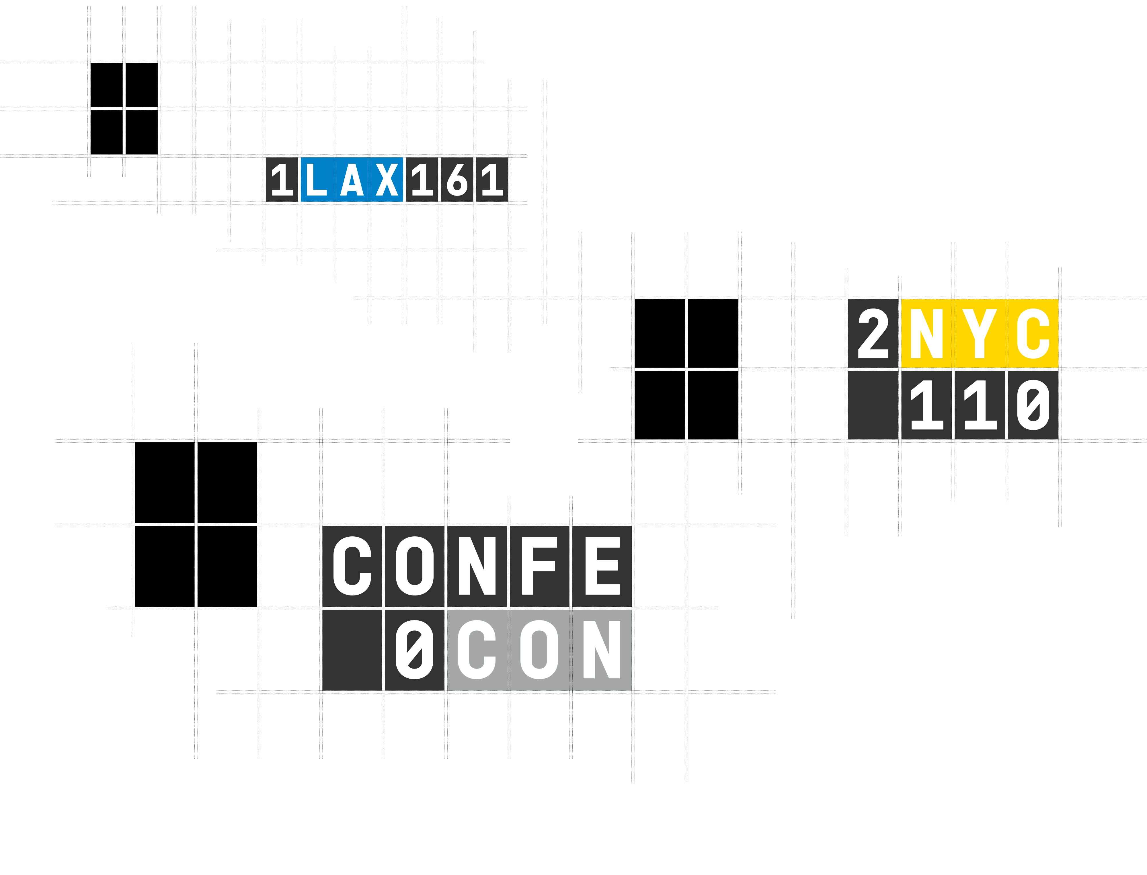
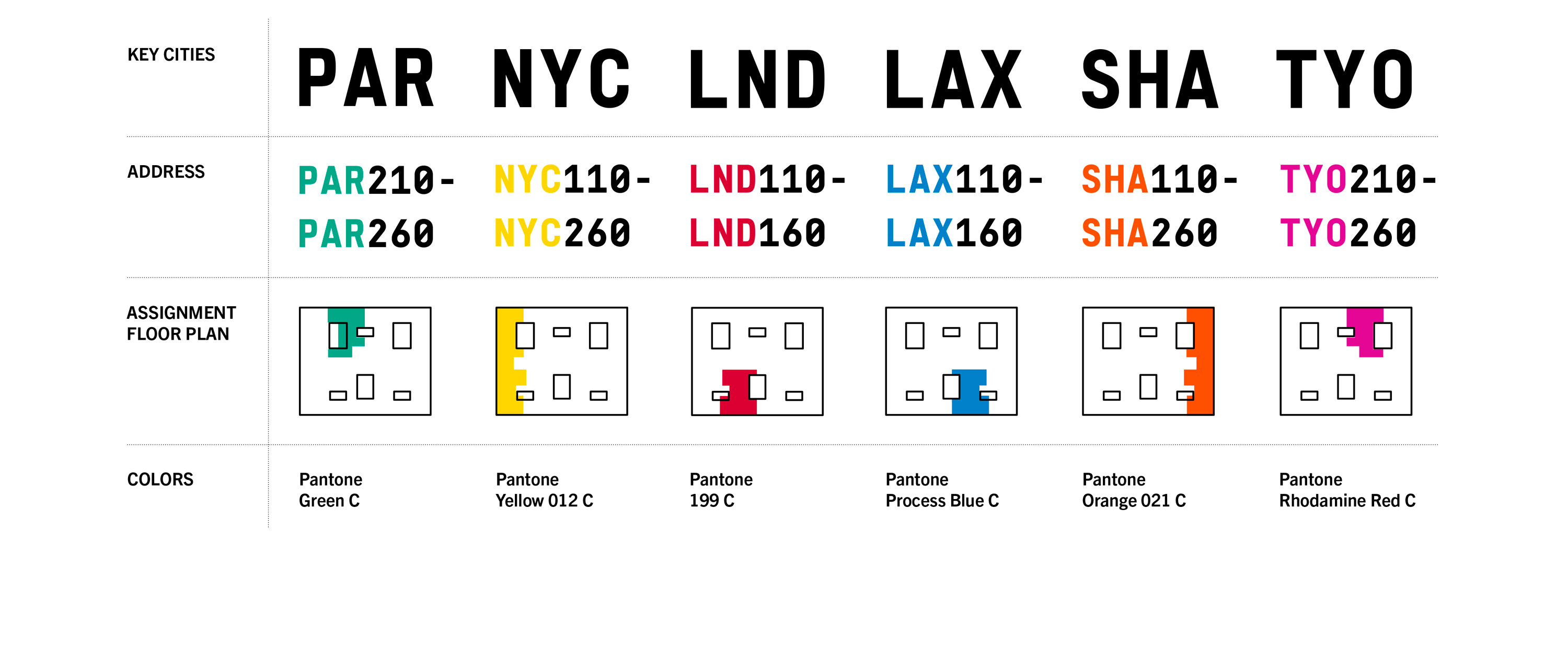
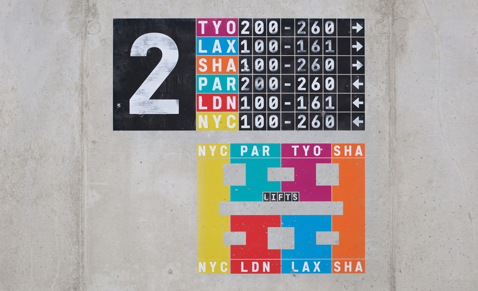
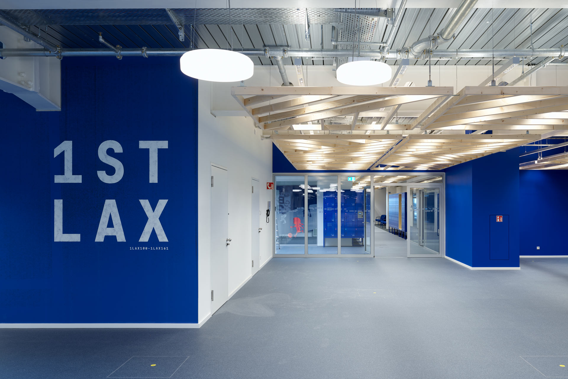
6 so-called key cities had been defined by the architects and the client to be used as role model for 6 different spatial identities per floor to be stacked on the 3 upper levels of the building. Together they chose colors that had been declared to represent these cities the best. That was, what welcomed us, when we joined the design team.
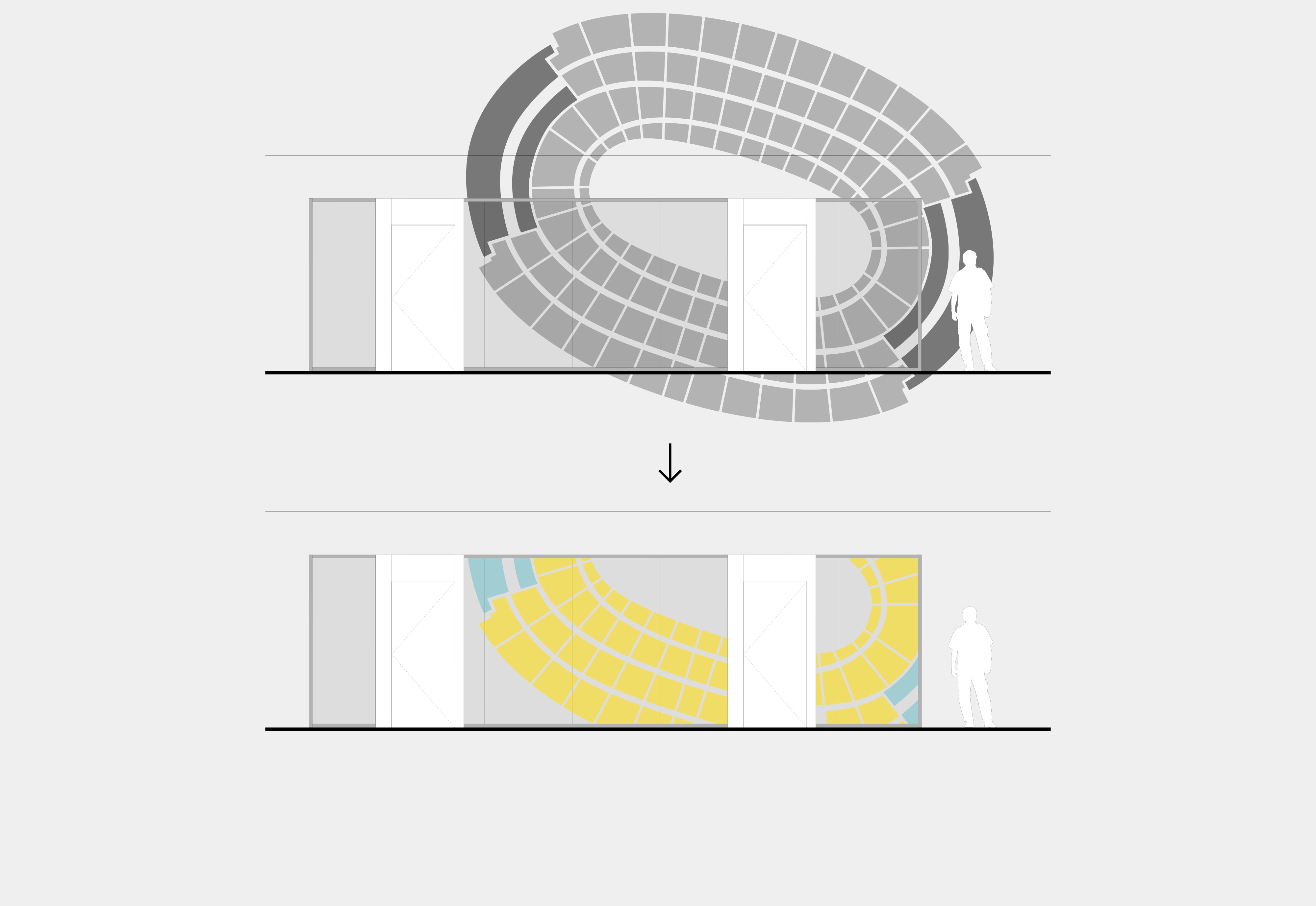
Our orientation system uses bolder color shades, adds a three-digit city code and a decimal system with tens steps for generating unique addresses throughout the open floor plan.


GRAPHICS
As a slightly more poetic interpretation of the somewhat worn idea of key cities, we placed blown-up illustrations of stadium top views on the glazed partitions. Applied with mirror film aka spy film the graphics nicely contribute to a diffuse and fragmented visual play by blending foreground and background.
Does it help? We don't know.
Does it look beautiful? Yes, it does.