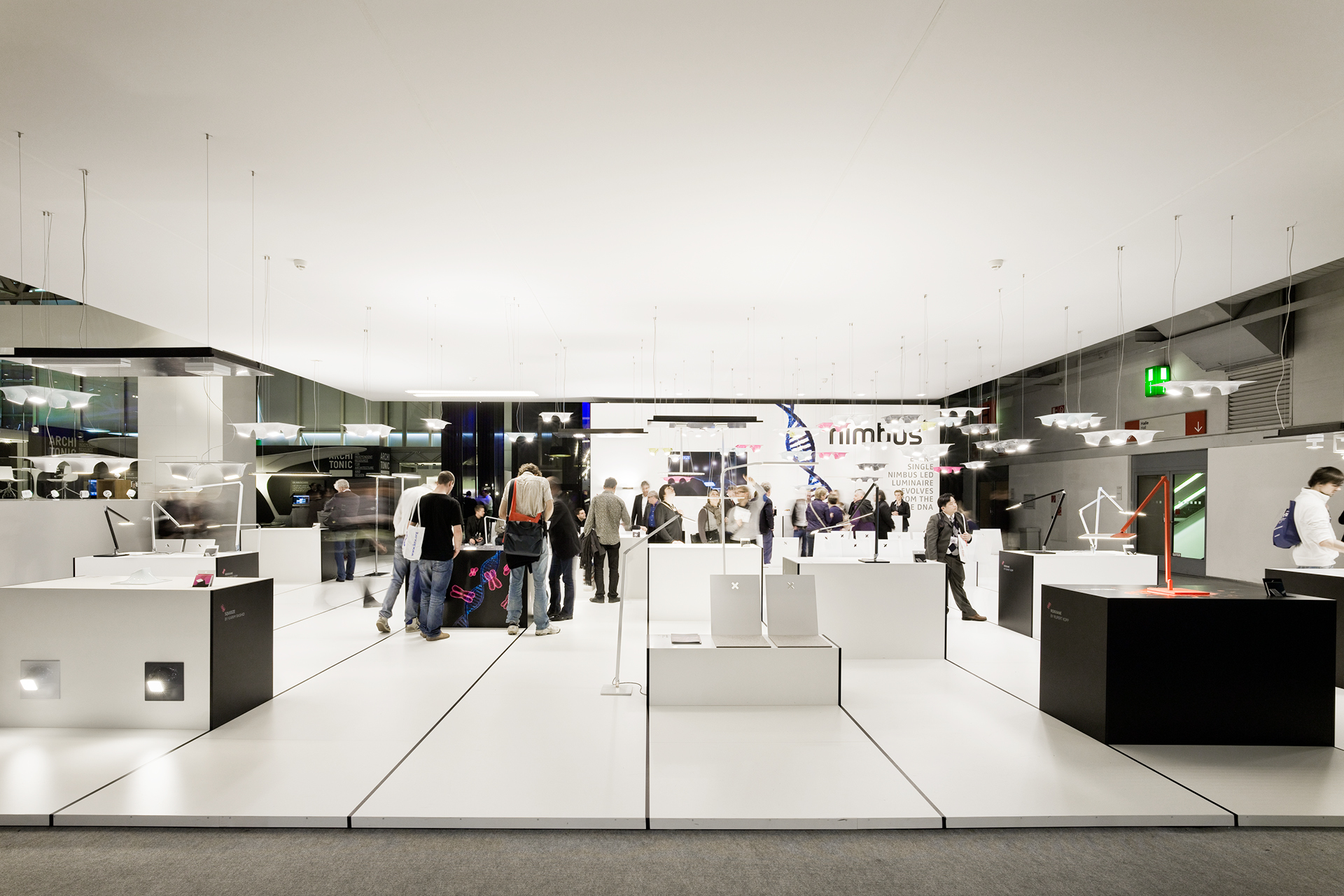
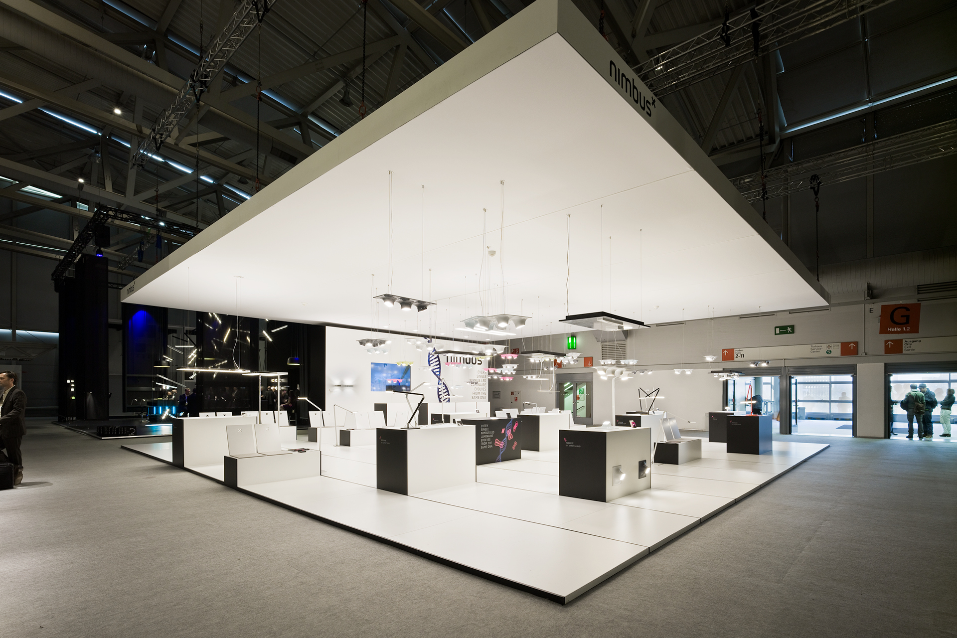
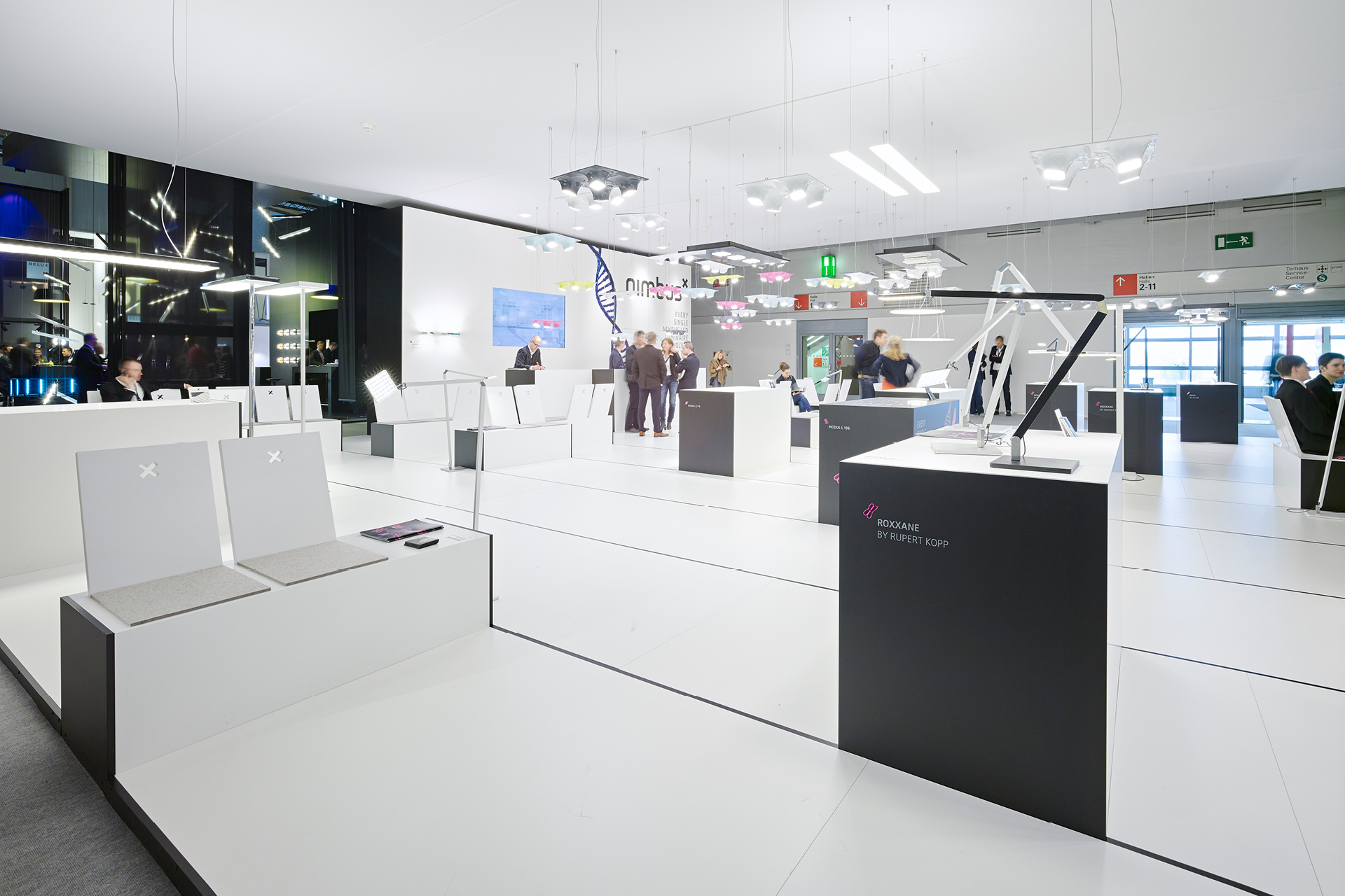
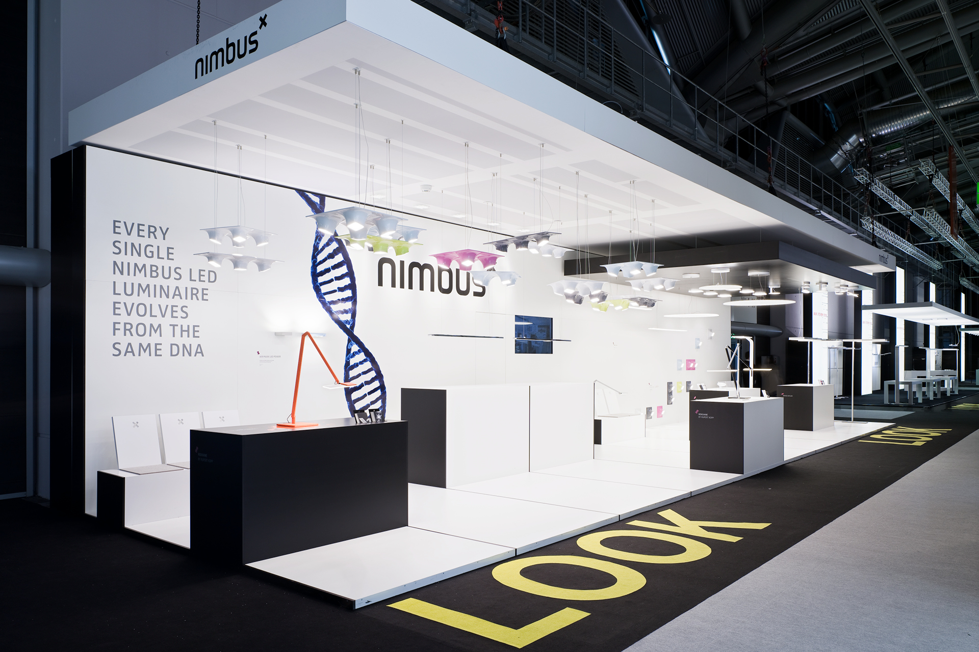
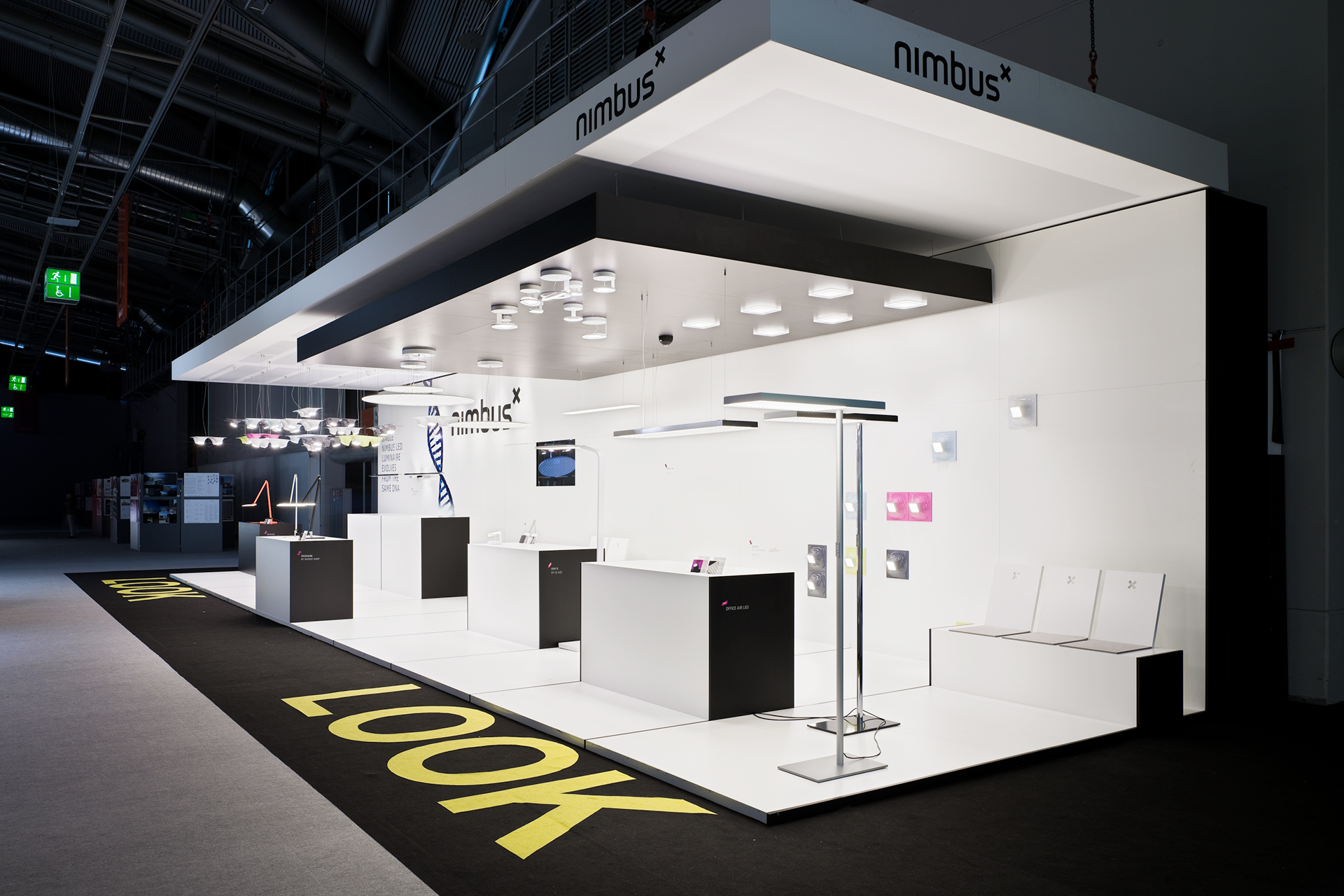
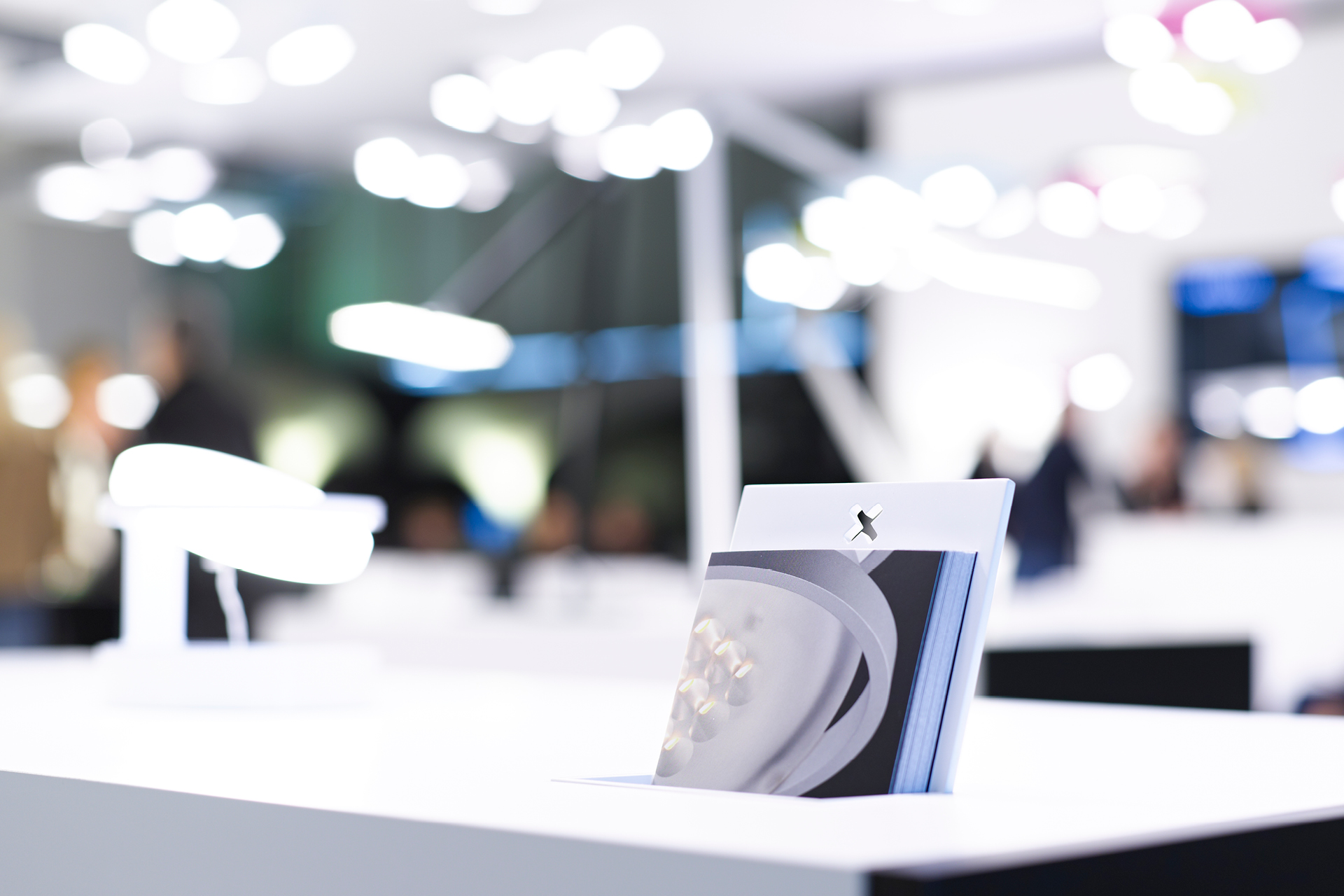
Project Fair stand Nimbus
Client Nimbus Group
Location Light + Building 2012, Frankfurt a. M.
Date 2012

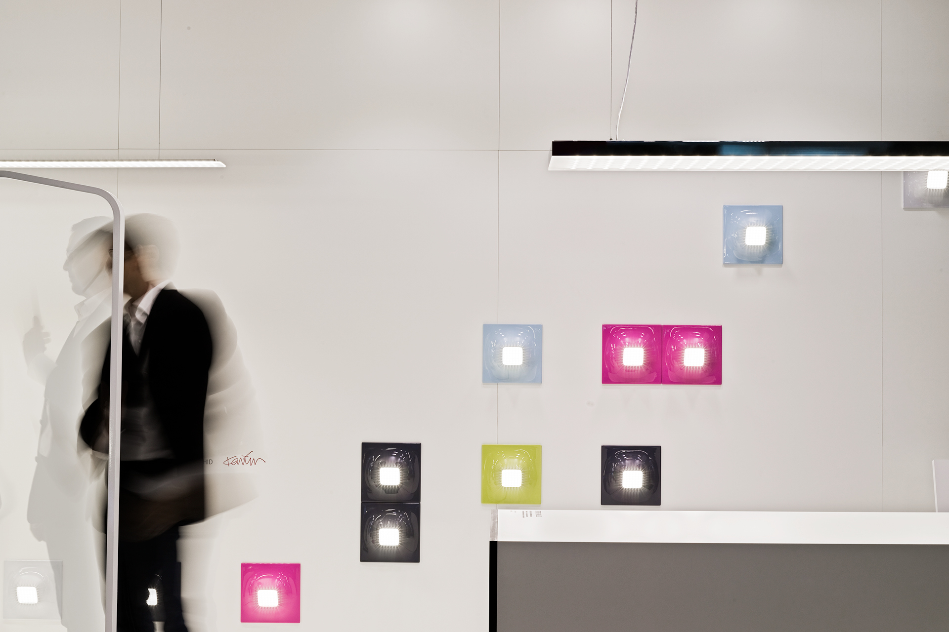
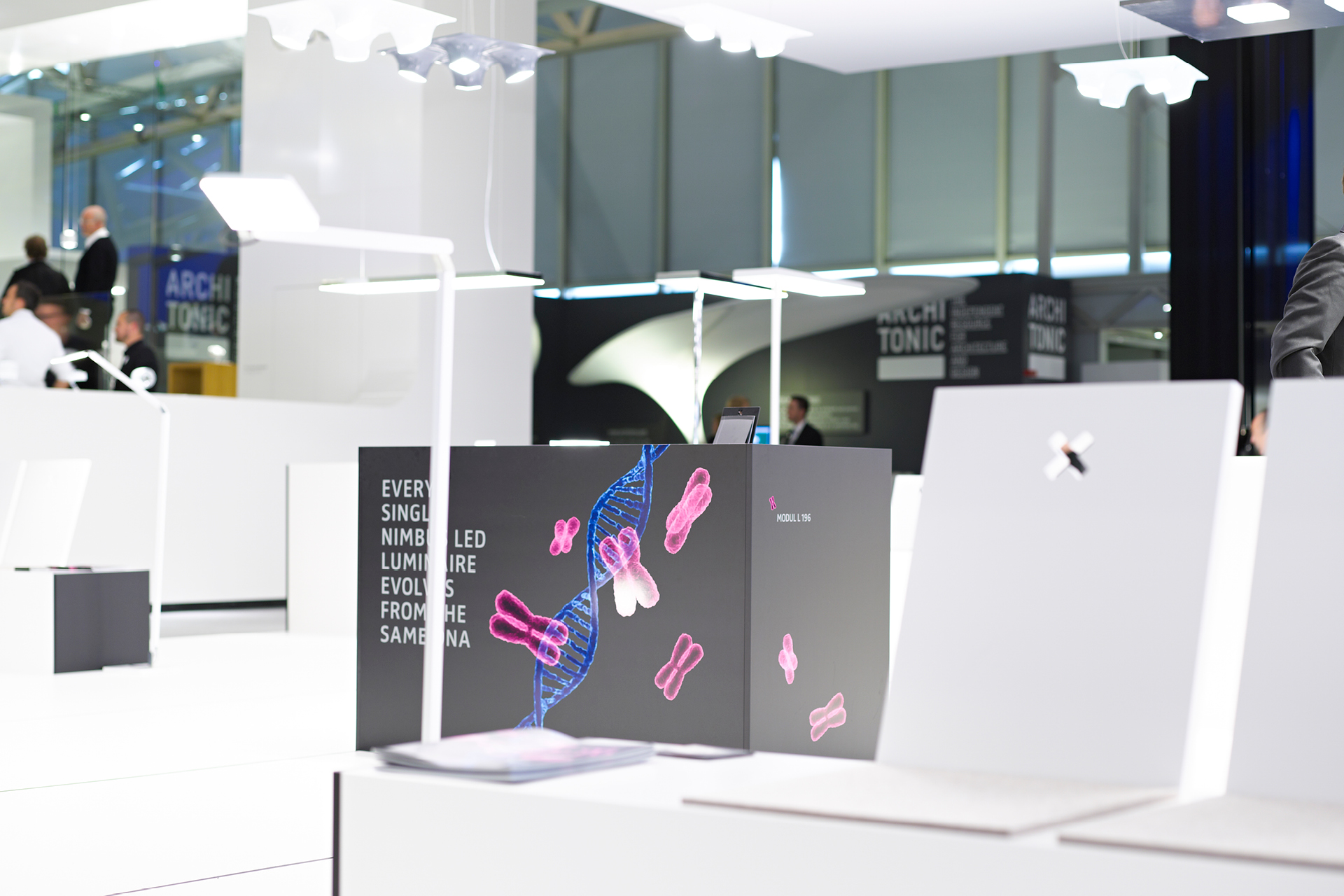
For the 2012 light+building fair our client had a wide range of totally different luminaires to show. We reacted with a functional design that stepped back formally and provided a perfect background for the expressive luminaire designs, both in form and in color.

Space

Basically the design featured 5 supersimple elements. Floor, ceiling, rear wall, counter and bench. Arranged on something looking like an additive rail system on the floor, the position of counters and benches created different spatial densities.

Despite their totally different appearance in form and function and designed by different designers, the luminaires originated from one common root, they carried the same DNA within themselves. Strong enough for a fun key visual.

Satellite

Light+building is the world's biggest fair for lighting solutions and spreads over eleven halls. Nimbus, our client, decided 2012 to be present in two of them, the retailer's hall with a bigger space and the architect's hall with a smaller space. A satellite was born using the exact same design principles as its mothership, though much more compressed, but nonetheless aesthetic.

Print

The DNA theme was from the dominant sort and found its way on the cover of the catalogue. To prove it we created a comprehensive illustration showing the bloodline of the product family members.

Thoroughly designed postcards with product information were placed in recesses in the dedicated counters. The postman didn't bring a single one back to us until now, but that doesn't mean anything.